How to Match Different Wood Tones in One Room?

Time:2026-09-22 Author:Liam
0%

How to match different wood tones in one room? The answer begins with observation, not a rigid decorating rule. Wood changes under daylight, warm bulbs, surrounding paint, and nearby fabrics. A walnut table may appear chocolate-brown at noon, then almost red beside cream upholstery. Experienced designers usually compare samples inside the actual room. Screenshots are not enough.

Professional research supports this natural, layered approach. The National Kitchen & Bath Association’s 2024 Design Trends Report highlights warmer finishes, natural materials, and personalized spaces as continuing priorities. Houzz’s 2024 U.S. Kitchen Trends Study also shows that homeowners increasingly invest in renovated spaces designed around personal use and visual character. These findings suggest that matching every wooden surface perfectly is less important than creating a deliberate relationship between them. Harmony matters more than uniformity.

Start with the undertone. Identify whether each piece leans yellow, red, gray, or neutral. Then choose one dominant wood tone, one supporting tone, and perhaps a small accent. Repeat each tone at least twice, such as through a frame, chair leg, shelf, or woven basket. Keep contrast visible, but control the scale. A pale oak floor can support a darker walnut cabinet when textiles bridge the gap.

Not every combination works. I have seen beautiful woods compete because their finishes were equally glossy and their colors nearly matched. That mistake is easy to make. Matte surfaces, varied grain direction, and a shared metal or fabric accent can restore balance. Test real samples first, preferably in morning and evening light. The room should feel collected, not accidentally assembled.
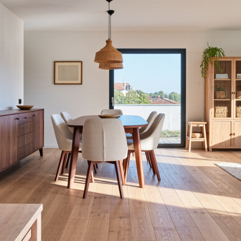
How to Match Different Wood Tones in One Room?

Identify the Wood Tones and Undertones in Your Room

Before matching wood tones, identify what is already in the room. Do not judge color under yellow bulbs. Check flooring, tables, doors, and exposed shelves in natural daylight. Look for the dominant tone: pale, honey, reddish, brown, or nearly black. Then inspect the undertone. A brown surface may lean yellow, orange, red, gray, or green. Grain direction can mislead you.

The USDA Forest Products Laboratory’s Wood Handbook, FPL-GTR-282, explains that wood color varies within the same species. Light exposure, oxidation, and finishing products also change its appearance. CIE 015:2018 uses the CIELAB system to describe color more precisely. Its L value runs from 0, or black, to 100, or white. The a and b values show red-green and yellow-blue movement. You do not need laboratory equipment, but this logic helps. A warm oak floor beside a red-brown table may look muddy, even when both seem “brown.”

Use large samples, not tiny chips. Place them beside the existing wood, a white sheet, and the room’s largest textile. I once matched two “neutral” samples under store lighting; they looked noticeably orange at home. That mistake was useful. Undertones often appear only across a wider surface. Compare samples at morning and evening. If the undertones clash, add a separating material, such as stone, painted wood, or woven fabric. Matching everything perfectly can also feel flat. A controlled contrast usually feels more natural.

Choose a Dominant Wood Tone for the Space

Choose one dominant wood tone before adding anything else. This anchor should cover the largest wooden surface, such as flooring, built-in cabinets, or a dining table. Warm oak creates a light, welcoming foundation. Walnut feels deeper and more formal. Pale ash can make a compact room appear brighter. In my projects, matching the dominant tone to the floor usually creates the calmest result. It is not a strict rule, though.

Use supporting woods as accents, not competitors. A side table, chair frame, or picture frame can differ by one or two shades. Repeat each secondary tone at least twice. This helps the room feel intentional rather than randomly furnished. Pay attention to undertones, too. Yellow, red, and gray undertones may clash under evening lighting. I once approved a sample beside a sunny window, then disliked it at night. That mistake changed my process.

Tips: Collect physical samples and view them in morning, afternoon, and lamplight. Compare grain direction, finish, and surface texture. Keep one wood tone visually dominant. If the room feels busy, remove one finish before adding another. Slight variation is useful. Too much matching can look flat.

How to Match Different Wood Tones in One Room?

Choose one dominant wood tone for the space, then use secondary and accent tones in smaller visual proportions to create balance.

The 60–30–10 distribution is a practical interior-design planning guideline: use the dominant tone for the largest wood surfaces, the secondary tone for supporting furniture or details, and the accent tone sparingly for contrast.

Balance Warm and Cool Woods with Color and Contrast

How to Match Different Wood Tones in One Room?

Balance Warm and Cool Woods with Color and Contrast

Mixing wood tones works best when temperature leads the design. Warm woods show red, orange, or golden undertones. Cool woods lean gray, taupe, or muted brown. Choose one dominant tone, then add a secondary wood for contrast. A walnut dining table can sit comfortably beside pale oak flooring when both share a similar grain direction or visual weight.

Use color to connect the pieces. Warm wood benefits from clay, olive, cream, and muted terracotta. Cool wood pairs well with soft blue, charcoal, sage, and crisp white. Avoid matching every tone exactly. That often makes the room feel flat. Instead, repeat each wood at least twice through furniture, frames, shelves, or woven details.

Contrast needs control. Place a darker wood against a lighter wall, not another busy pattern. Keep the strongest contrast near the room’s focal point. In practice, I test samples beside the window and under evening lighting. Finishes can shift dramatically. Trust the undertone.

The 2022 National Association of Realtors Remodeling Impact Report reported a 147% cost recovery for hardwood refinishing and 118% for new wood flooring. Those figures support thoughtful wood investment, but they do not guarantee visual harmony. A mistake is still possible. One sample may look perfect in a showroom and too orange at home. Recheck it before committing.

How to Match Different Wood Tones in One Room?

Balance Warm and Cool Woods with Color and Contrast

Wood Tone Typical Undertone Best Color Partners Useful Contrast Level How to Combine It with Other Woods Practical Room Application
Light Oak Light to medium value with beige, honey, or soft golden undertones. Warm white, ivory, muted sage, dusty blue, charcoal, and soft terracotta. Medium contrast works well. Pair with a noticeably darker wood or a deeper wall color. Use as the dominant floor or cabinet tone. Add walnut or espresso accents to create visual definition. Suitable for flooring, built-in storage, dining tables, and large casework in bright or compact rooms.
Natural Maple Light value with creamy yellow, peach, or golden undertones. Warm white, pale gray with a warm base, muted green, denim blue, and clay tones. Low to medium contrast keeps the room calm; dark accents prevent a washed-out appearance. Repeat its warmth through upholstery or wall color, then introduce cooler wood only in small, intentional pieces. Works well for kitchen cabinetry, desks, shelving, and furniture in rooms with moderate natural light.
Cherry Medium to dark value with strong red, rust, or warm brown undertones that deepen over time. Warm ivory, olive green, blue-gray, muted teal, and soft mushroom neutrals. Medium contrast is usually more balanced than another strong red-toned wood. Combine with neutral or subtly cool woods, such as white oak, to reduce visual heaviness. Avoid several red woods together. Best used for a focal item, cabinetry, or architectural detail rather than every wood surface in the room.
Walnut Medium-dark value with brown, cocoa, and sometimes slightly gray or purple undertones. Warm white, greige, pale blue, muted green, camel, and black accents. High value contrast with light woods creates a clear, intentional hierarchy. Pair with light oak or white oak when walnut is used for a table, console, or occasional furniture. Excellent for statement furniture, shelves, trim, and dining tables against lighter floors or walls.
Espresso or Very Dark Brown Very dark value with neutral brown, chocolate, or occasionally cool gray undertones. Warm white, light greige, pale blue-gray, muted blush, and soft natural textiles. High contrast should be balanced with lighter walls, flooring, or upholstery. Use sparingly as an anchor. Repeat the dark value in two or three smaller elements so it feels deliberate. Effective for coffee tables, window trim, shelving, or dining chairs in rooms with sufficient light.
White Oak Light to medium value with neutral beige, taupe, or softly gray undertones. Cool white, warm white, blue-gray, sage, sand, and muted black. Low contrast creates a quiet look; medium contrast adds definition without overpowering the grain. Its relatively balanced undertone makes it a useful bridge between warmer maple or cherry and cooler gray-brown finishes. Appropriate for flooring, wall paneling, cabinetry, and furniture when a flexible foundation is needed.
Warm Wood + Cool Wood Mixed undertones, such as golden oak with gray-brown or neutral white oak. Choose a unifying color: warm white, taupe, greige, muted green, or blue-gray. Use clear value contrast and avoid pairing woods that are almost identical but have different undertones. Repeat each wood at least twice, or connect them with a rug, textile, metal finish, or painted surface. Useful when existing flooring cannot be changed but new furniture or cabinetry must be introduced.
Three or More Wood Tones A combination of light, medium, and dark values with varied undertones. Keep walls and large textiles relatively restrained so the wood grain remains visually organized. Establish one dominant tone, one supporting tone, and one small accent tone. Vary both scale and placement: use the dominant wood on the largest surface, the supporting wood on furniture, and the accent wood in limited details. Works best in open-plan rooms where a consistent color palette links separate furniture groups.
Design rule: Match wood tones by considering undertone, value, grain direction, and visual proportion—not by trying to make every wood finish identical. Always review samples in the room's natural and artificial light before making a final selection.

Repeat Wood Finishes to Create Visual Cohesion

Repeat Wood Finishes to Create Visual Cohesion

Matching every wood tone can make a room feel staged. Repeating finishes creates a calmer, more believable rhythm. In projects I have worked on, I often repeat one finish at least three times: a walnut console, a walnut picture frame, and a small side table. The pieces do not need identical grain or age. Their shared undertone does the work. Warm oak beside warm walnut can succeed when textiles, wall color, or metal accents soften the transition.

Scale also matters. Use the darkest finish on one substantial item, then echo it through smaller objects. A dark-stained dining table might connect with black-brown chair legs and a narrow shelf. Keep the lighter wood visible elsewhere, perhaps in flooring or woven seating.

Houzz’s 2024 U.S. Kitchen Trends Study identifies natural wood as a leading cabinet preference, supporting its continued role in contemporary interiors. The U.S. Forest Service’s 2023 Forest Products Annual Market Review also reports billions of board feet in domestic lumber use, reminding us that wood remains a significant material, not a passing decoration.

I still misjudge combinations sometimes. Two “warm” finishes can look orange under evening lighting. Test samples beside windows, lamps, and existing flooring. Repeat the finish, not necessarily the furniture style. A brushed oak frame, an unfinished stool, and a softly worn cabinet may feel more cohesive than three matching pieces. Small repetition often looks intentional. Too much repetition becomes predictable.

Unify Different Woods Through Texture and Accessories

How to Match Different Wood Tones in One Room?

Different wood tones can feel intentional when texture creates a clear visual connection. Start by comparing the grain, finish, and surface age of each piece. A pale oak table may work beside a darker walnut cabinet if both show visible, natural grain. Smooth wood beside heavily distressed wood can feel less balanced.

Texture does the quiet unifying work. Pair polished wood with woven linen, ribbed cotton, or a rough ceramic vase. These materials soften sharp color differences and add tactile repetition. A jute rug can connect warm floors with cooler furniture. Keep the texture consistent, not identical. Too much matching can make the room feel staged.

Accessories should repeat the room’s strongest qualities. Use two or three objects with related colors, such as amber glass, tan leather, or muted clay. Place them at different heights to guide the eye across the space. Metal details can help, but use one dominant finish for stability.

I once combined four wood tones without checking them in daylight. The room looked fine at night, yet strangely disconnected each morning. Natural light exposed the mistake. A small sample board would have helped.

Leave one wood tone dominant, and let the others support it. A little imperfection can add character. Too much becomes visual noise.

FAQS

How should I identify the existing wood tones in a room?

Check floors, tables, doors, and shelves in natural daylight. Ignore yellow bulbs. Find the dominant color: pale, honey, reddish, brown, or nearly black. Then inspect its undertone.

Why can two brown woods look wrong together?

Their undertones may clash. A warm floor beside a red-brown table can look muddy. Grain direction can also deceive your eye. Brown is not one color.

When should I compare wood samples?

Compare them in morning and evening light. Place large samples beside existing wood, a white sheet, and the largest textile. Tiny chips hide undertones. They often lie.

Does wood change color over time?

Yes. Light exposure, oxidation, and finishes can alter its appearance. A new sample may not match older flooring immediately. Recheck it at home, not only in a shop.

Can different wood tones work in one room?

Yes, when grain and texture create a connection. Visible natural grain can link pale oak with darker wood. Similar surface character helps. Perfect matching is unnecessary.

What textures can soften mismatched wood?

Try woven linen, ribbed cotton, rough ceramic, or a jute rug. These materials interrupt sharp color differences. Repeat texture without making every item identical.

How should accessories connect several wood tones?

Repeat two or three related colors, such as amber, tan, or muted clay. Place objects at different heights. This guides the eye across the room. Too many accents create noise.

Should every wood tone match?

No. Keep one tone dominant, while the others support it. Add stone, painted wood, or woven fabric between clashing surfaces. Controlled contrast usually feels more natural.

How can lighting expose a poor wood match?

Store lighting can hide orange or red undertones. Natural morning light may reveal them clearly. I once trusted evening lighting and missed the problem. A sample board would have helped.

Conclusion

How to match different wood tones in one room? Start by identifying the colors and undertones already present in your flooring, furniture, trim, and decorative details. Notice whether each wood feels warm, cool, light, or dark, then choose one dominant wood tone to give the room a clear visual foundation. Other wood finishes can support this main tone without making the space feel random or overcrowded.

To balance contrasting woods, use wall colors, fabrics, rugs, and artwork to create harmony between warm and cool finishes. Repeating selected wood tones in more than one area helps establish visual cohesion, while varying the scale and placement keeps the room interesting. Texture also plays an important role: combining smooth, rustic, matte, or grain-rich surfaces can connect different woods naturally. Finally, accessories such as baskets, lamps, ceramics, and textiles can bridge the tones and create a comfortable, thoughtfully layered interior.

Liam

Liam

Liam is a dedicated marketing professional with a profound expertise in the industry, where he excels at highlighting the unique advantages of our core products. With a keen understanding of market trends and consumer needs, Liam frequently updates our company’s professional blog, providing......