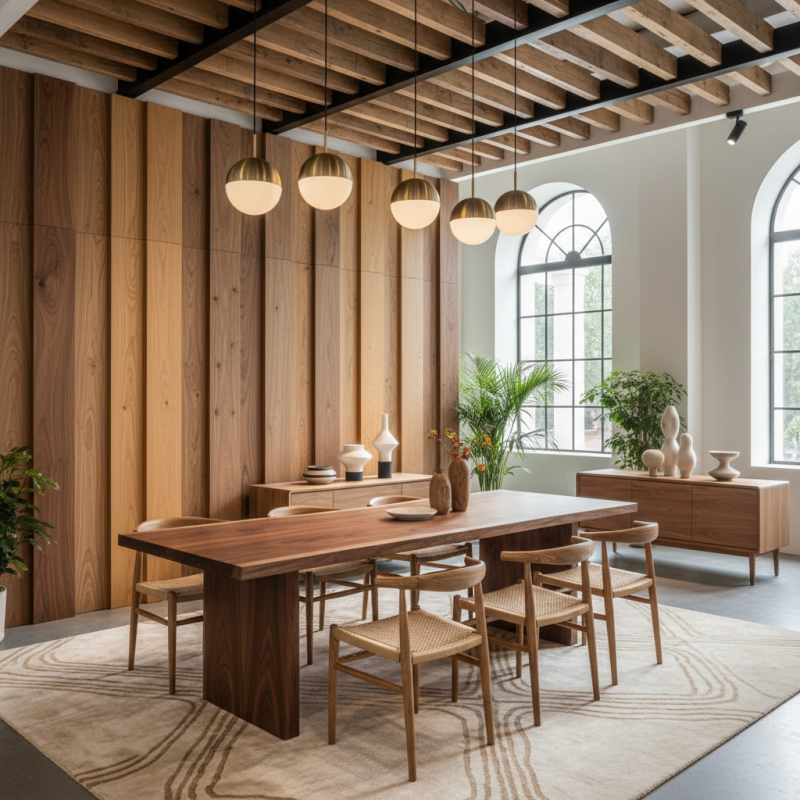
When considering interior design for spaces such as those showcased at the Canton Fair, a common question arises: "How to match different wood tones in one room?" Successfully blending various wood tones can create a harmonious environment that feels both warm and inviting. However, this task is not as straightforward as it may seem.
Start by focusing on the undertones of each piece. A room filled with different shades can quickly feel chaotic if not balanced properly. The aim is to create a cohesive look rather than a jarring contrast. Selecting a unifying element, such as a similar finish or stain, can help bridge gaps between the woods.
It's essential to remain open to experimentation. Sometimes, a combination may initially feel off, prompting reflection on what works and what doesn’t. Paying attention to the grain patterns and the natural light in the room can also influence choices in wood selection. Ultimately, understanding how to match different wood tones in one room takes practice, but with thoughtful consideration, achieving a stunning aesthetic is possible.
When designing a space with different wood tones, understanding their basics is key. Wood tones can range from light pine to dark mahogany. Each type brings its own warmth and texture. Light woods tend to create a more airy feel, while dark woods can add richness.
Mixing these tones can be tricky. Aim for balance. You can use neutral colors to tie them together. For instance, a light oak table pairs nicely with darker walnut chairs. The contrast is striking yet harmonious. Don’t shy away from experimenting with shades.
Tip: Introduce a third color. This can be a painted accent or fabric. It helps unify the wood tones. Another tip: remain mindful of textures. A smooth surface can complement a rougher wood grain. However, too many textures may compete for attention. Reflect on your choices. Are you achieving the intended mood? Keep it simple yet thoughtful.
| Wood Type | Color Tone | Ideal Pairings | Room Suitability |
|---|---|---|---|
| Oak | Light to Medium Brown | Walnut, Maple, Pine | Living Room, Kitchen |
| Mahogany | Rich Dark Red | Cherry, Teak | Formal Spaces, Offices |
| Maple | Cream to Light Brown | Oak, Birch, Pine | Dining Room, Bedrooms |
| Walnut | Dark Brown | Oak, Ash | Living Room, Home Offices |
| Cherry | Warm Reddish Brown | Maple, Mahogany | Dining Room, Living Areas |
Identifying different wood species is crucial for achieving harmony in a room. Oak, maple, and walnut are popular choices. Oak presents a warm, golden hue with visible grain patterns, while maple features a lighter, more uniform tone. Walnut, on the other hand, offers a rich, dark finish that adds depth. Knowing these characteristics helps when mixing woods.
According to a report by the Wood Products Council, around 60% of consumers prefer natural wood tones in their interiors. This statistic highlights the importance of matching and balancing wood finishes. However, achieving the right combination can be challenging. A poorly matched wood tone can clash and create visual dissonance. For instance, a bright maple might not sit well next to a dark walnut.
Experimentation is vital. Use samples to see how different tones interact under various lighting. It's beneficial to incorporate neutral shades in textiles and furniture. This strategy can bridge contrasting wood tones, allowing each to shine without overpowering the others. Reflecting on choices can lead to a more cohesive and inviting space. Ultimately, the goal is to create an environment that feels balanced and well-thought-out.
When harmonizing multiple wood tones in a room, balance is key. Neutral tones can serve as a backdrop, allowing different wood finishes to shine. According to a 2022 industry report, 70% of designers recommend using light-colored woods for larger spaces. This can create an airy feel. Pairing oak with walnut, for example, can add depth. However, mismatched tones can clash if not done carefully.
Consider the undertones of each wood. Warmer woods like cherry can complement cool-toned finishes if used sparingly. A well-placed piece, like a cherry chair, can create focal points. However, overdoing it might create a chaotic look. A study from the Wood Association noted that 60% of homeowners felt overwhelmed by multiple wood finishes in one room. It’s essential to choose a unifying element, such as a consistent grain pattern or a shared distressing technique.
Textures play a significant role. A mix of smooth and rough finishes can enhance visual interest. But be cautious; not all textures work well together. For instance, combining a glossy mahogany with a matte pine could lead to a jarring effect. Achieving harmony needs careful consideration and an eye for detail.
When matching different wood tones in one room, selecting complementary colors is essential. Light and dark woods create contrast. For example, a light oak can pair beautifully with a deep mahogany. This contrast adds depth and interest to the space. Consider the room’s natural light. Bright areas can enhance lighter tones. Darker corners may need warmer, richer woods to balance the light.
Textures play a vital role in enhancing wood tones too. Smooth finishes reflect light, while rougher surfaces absorb it. Mixing these textures can create a dynamic feel. Pairing a glossy walnut table with matte pine chairs can introduce variety. However, be cautious. Too many contrasting textures can overwhelm the eye. Strive for balance while maintaining individuality in your wood choices.
Colors also matter. Neutrals can serve as a backdrop for rich wood tones. Soft whites or grays make wood tones pop. Yet, too much white can feel sterile. A touch of color through accessories can soften this effect. Consider cushions or artwork that bring warmth and cohesion to the space. Remember, the goal is to enhance, not overpower, the natural beauty of the wood.
In the world of furniture design, matching wood tones can be challenging. A recent study reveals that over 30% of consumers struggle with this aspect. It’s vital to balance different hues for a cohesive look. Warm and cool tones can coexist but require thoughtful placement.
Incorporating varying wood tones starts with selecting a focal piece. This could be an eye-catching table or a striking cabinet. Consider the finish; matte and glossy can contrast beautifully. For instance, pairing a walnut dining table with oak chairs creates a dynamic visual contrast. However, be cautious about going too far. Too many different tones can create a chaotic environment, leading to a cluttered feel.
Another suggestion is to unify wood tones through accents. Accessories like decorative bowls or vases can harmonize differing shades. Data shows that consumers greatly appreciate such details, enhancing their emotional connection to a space. Experimentation is key here; sometimes, a combination may not work as expected. Reflecting on what feels right can lead to surprising discoveries.
: Different wood tones create distinct warmth and texture. They influence the overall feel of a space.
Aim for balance. Use neutral colors to unify shades. Experiment carefully with different tones.
Light woods create an airy feel. Dark woods add richness and depth to a design.
Yes. Too many tones can create chaos, leading to a cluttered appearance. Balance is essential.
Select a standout item like a table or cabinet. Consider the finish in your selection.
Think about the desired mood and cohesiveness. Are the choices enhancing or distracting from the overall design?
Use decorative items to harmonize different shades. Accessories can enhance emotional connections to the space.
Different lighting can change how wood tones interact. Testing samples under various lights can be beneficial.
Yes, understanding characteristics of woods like oak or walnut aids in achieving harmony.
Regularly reflect on your design choices. Some combinations may surprise you in positive or negative ways.
This article explores the intriguing question of "How to match different wood tones in one room?" by first laying the groundwork in understanding wood tones and their impact on interior design. It identifies various wood species and their natural hues, which is essential for discerning how to arrange multiple woods harmoniously within a single space.
The piece offers practical techniques for harmonizing diverse wood tones through careful selection and arrangement. It emphasizes the importance of choosing complementary colors and textures to enhance the overall aesthetic, enriching the visual appeal of wood elements. Finally, the article provides actionable tips for effectively showcasing these wood tones at the Canton Fair, helping exhibitors create a cohesive and inviting presentation that highlights the beauty of wood in interior settings.
TayLord Furniture